
CAMERA CONVENTIONS
in GRAPHIC NOVELS
In THEATRICAL vs. CINEMATIC STORYTELLING, I mention a lot of things like “zoom,” “pan,” “establishing shot,” etc, which are terms typically used to direct cinematography in movies. While there aren’t any “cameras” in comics, the artist is still both director and cinematographer: they decide what to draw and how to draw it in order to ensure that a scene reads clearly, to capture a particular tone or mood, and to convey character’s emotions.
By directing the “camera” in comics, panel-to-panel, we are able to communicate to the reader more specific moods and ideas as well as to give the reader a sense of being a part of a scene instead of in the audience (though if that’s your intent, we cover that here too!) It’s important for writers to be aware of these conventions as well; it will help you to think more visually and to write scripts that play to those specific visuals and how to word them.
But these aren’t hard-and-fast rules. They are rather a guide to help make more informed choices when trying to capture a scene’s essence as well as ideas to add visual interest so scenes don’t become monotonous with too much of the same types of shots. Rather than following these conventions slavishly, think of them as a springboard for more creative direction, as well as a method for exploring and establishing your own unique visual storytelling Voice.
ESTABLISHING SHOT
The establishing shot is a comics panel that establishes setting. Major scene transitions often begin with an establishing shot. But not always! They tend to be used if establishing a specific location is important to the scene. This can be the outside of a building, the interior of a room, a specific locale like the bottom of the sea, or even … space!

Kristen Gudsnick’s “Making Friends”

Jillian Tamaki and Mariko Tamaki’s “This One Summer”

Stephen McCranie’s “Space Boy”
Establishing shots also have the effect of pausing the action. This allows readers time to mentally digest a previous scene before diving into the next one. If you’re an artist who loathes drawing backgrounds, don’t underestimate the power of establishing shots! Establishing shots don’t need to be super detailed, but they should give enough information to set the location (and even the tone) of the approaching scene. They can even be a method of foreshadowing: a spooky looking house is probably going to be a spooky haunted scene. A magical unicorn castle is probably going to be magical and unicorny. Or if you’re going for humor, irony or juxtoposition (two ideas at odds with one another, something comics do REALLY well), showing a location at odds with a reveal (a spooky looking house inhabited by unicorn-loving gnomes tending their wish-fairy rainbow garden) can be pure magic!
WIDE ANGLE
The wide angle shot is a bit different from an establishing shot in that it occurs within a scene that is already well underway. It’s still a large, pulled out shot–usually with at least some background–but typically it’s used to give the reader a wider range of information outside of a character’s immediate vicinity.
The wide angle shot creates a sense of SPACE. It can be used to show the emotional distance between characters or to connect them relative to their locations to each other within the shot. It can estrange them from their environment or make them feel like they’re a part of it. It can even establish social relation to the group: being a part of it or being separated from it.

Mariko Tamaki and Rosemary Valero-O’Connell’s “Laura Dean Keeps Breaking Up With Me”

Jillian Tamaki and Mariko Tamaki’s “This One Summer”

Vera Brosgol’s “Be Prepared”

Raina Telgemeier’s “Smile”

Raina Telgemeier’s “Smile”
Like the establishing shot, the wide-angle shot bestows power upon backgrounds. The space provided by backgrounds allows the reader to escape the character’s immediate emotional sphere and superimpose their own experiences and feelings in the space around them. But it also gives the artist room to utilize their skills to make compositions that can feel peaceful, exciting, distressing, disorienting, joyful, etc…the whole gamut of expressions that fall outside of just facial expressions and body-language. Wide-angle shots are a way of taking the mood and heightening it then releasing it into a space that feels less immediate and more timeless.
LOW-ANGLE
In cinematography, the low-angle shot is when the “camera” is placed below the subject, pointed up. This makes the subject appear to tower over the reader, giving them the illusion of dominance. This can make a character (or an object) feel powerful, intimidating, or confident. The more the artist pushes this angle, the more exaggerating this effect becomes.

Stephen McCranie’s “Space Boy”

Craig Thompson’s “Blankets”

Kristen Gudsnuk’s “Making Friends”
HIGH-ANGLE
The high-angle shot positions the camera above the subject. This creates the effect of diminishing them. It makes them smaller and more vulnerable. It also has the effect of diminishing emotions and supressing them, or of creating a sense of discomfort or unease.

Vera Brosgol’s “Be Prepared”

Craig Thompson’s “Blankets”

Jillian Tamaki and Mariko Tamaki’s “This One Summer”
Both high-angle and low-angle shots create subtle insinuations about who is dominant/active and who is submissive/passive in a scene. They don’t need to be extreme all the time, however! Even a subtle shift high or low can add subconcious reactions in the readers about a character’s emotions beyond their facial expressions and immediate body language. And in comics, placing a character higher in a panel or lower has a similar effect to the high/low angle even when the character is shot side-on (next).
High/low shots are also incredily effective tools for breaking up scenes with a lot of dialog. “Talking heads” can be a real problem in comics. Try some high/low shots to break it up!
SIDE-ON
The side-on view is when the camera is at the same level as the subject matter (in camera conventions, this is called a STATIC SHOT, but SIDE-ON feels a more appropriate term for our non-moving comics). Not only is this the most common viewpoint in comics, the side-on view has the effect of putting the subject on equal footing with the viewer. Conversational comics, non-fiction, any sort of theatrical storytelling use the side-on view almost exclusively because it puts the reader on equal footing with the subject matter and makes it feel more accessible.

Maker Comics – Draw a Comic! by J.P. Coovert
But even high-emotion fiction often use the side-on view, especially when you aren’t actively trying to exaggerate an emotion or feeling beyond what’s being said/shown, have an aside (such as the character talking to themselves), or when you transition from one character to the next, setting that emotional reset button between characters (or scenes). A lot of scenes open with side-on views!
Also, comics for much younger readers often stick with a primarily side-on view, as do humor comics. Humor comics usually aren’t about emotional intensity but a play between words and imagery that playing too much with the camera could possibly take away from.
As for very young readers? Maybe it’s because like with reading books, reading comics takes exposure and practice to learn how to read them effectively. Side-on view is the simplest, most straight-forward way of showing a story and it’s wonderfully familiar.

Dave Pilkey’s DogMan

John Patrick Green’s “Investigators”
CLOSE-UP
The close-up creates visual and emotional intimicy with a character. It exaggerates the subtle and overblows the obvious. By allowing the reader close within a subject’s personal space, our empathy reaches into that character so that whatever that character is feeling becomes our own. Whether we feel sympathy or revulsion, sorrow or joy, the close-up amplifies those emotions.

Vera Brosgol’s “Be Prepared”

Mariko Tamaki and Rosemary Valero-O’Connell’s “Laura Dean Keeps Breaking Up With Me”

Jillian Tamaki and Mariko Tamaki’s “This One Summer”

Stephen McCranie’s “Space Boy”
CLOSE-IN
A close-in is different from a close-up in that is shows an object or an action rather than a person. It can show specific actions like feet hitting the pavement or hands folding dough. Close-ins give valuable information to the reader and bestow objects and actions with emotional as well as visual significance. A close-in of a letter or an action-in-progress tells the reader that this object or moment-in-time is important and to pay attention. If you have a “smoking gun” moment in your story, now is the time for a close-in!
Close-ins however, can also give the illusion of slowing down time. When we are bored, we often look more closely at the things around us. When we are in an emergency situation, sometimes it seems like time itself hits pause. A series of still frames showing close-ins of the environment or actions-in-progress can relate that sense of a wandering eye or of a rushed moment suspended in time.

Kevin Panetta and Savanna Ganucheau’s “Bloom”

Mariko Tamaki and Rosemary Valero-O’Connell’s “Laura Dean Keeps Breaking Up With Me”

Jen Wang’s “Koko Be Good”
ZOOM-IN
It may seem strange to use a word like “zoom” in comics since it implies motion in a static medium. In the context of comics, however, the zoom-in refers to how something is staged from panel to panel. The zoom-in gives the reader the illusion of physically moving closer to the subject matter, transitioning from distant-observer to intimate-aquantance within the space of a few panels. It allows us to emotionally intrude upon a character’s personal space gradually. Sometimes we meet new interesting characters this way. Sometimes, old characters in a new light with new information. The zoom-in creates immediate emotional empathy by allowing us to “intrude” upon a persons personal space as though the reader is seeing a person from across the room, walking up, and introducing themselves. Also, because the zoom-in lengthens time, these panels tells us, “This is something or someone important, so pay attention” and by zooming in, tells us exactly what the subject of that importance is!

Five World’s – “The Cobalt Prince”

Kevin Panetta and Savanna Ganucheau’s “Bloom”
ZOOM-OUT
The zoom-out slowly (or suddenly) zooms further and further out from the subject matter. While this can create a sense of physical distance from the character, it also has the effect of transforming the character’s emotions into our own, by giving the reader the space to transfer the emotions from the character to the negative space surrounding them, where the reader has the room to connect to that feeling through recollected experiences of their own. It puts the pause button on a moment so the reader has time for personal reflection.
The zoom-out is particularly effective at exaggerating a sense of isolation and loneliness because it creates a sense of being disconnected, of literally and emotionall “pulling away”.

Raina Telgemeier’s “Guts”

Vera Brosgol’s “Be Prepared”
FULL-BODY SHOT
While the full-body shot is classically used to show off clothes or fashion (MAKE-OVER!!!!), it can also draw attention to the fact that something is different in a character or to introduce new characters.

Emma Steinkellner’s “The Okay Witch”

Sam Bosma’s “Fantasy Sports v2”
AERIAL or BIRDSEYE VIEW
The Aerieal or Birdseye View is a shot of a scene as though taken from the view of a helicopter. This is the same as an establishing shot but from a drastically higher angle. Sometimes it’s better at giving more information because it encompasses a wider field of view. Sci-fi/fantasy/periodpiece worlds often utilize this shot a lot because new settings tend to be a major component of books set in worlds or times different from our own. A picture of a single building alone doesn’t always tell us enough. We must also see this WORLD or show off things that defy the physics of our own universe.
Sometimes however, it really is just another version of a wide-angle shot from higher up.

Sam Bosma’s “Fantasy Sports v2”

Five Worlds – “The Cobalt Prince”
OVERHEAD or WORMSEYE VIEW (extreme upward shot)
The extreme upward shot has MANY names, but no matter what you call it, it’s the view of somebody looking up at an object from far below. Superhero comics utilize this a LOT (lots of roof-jumping in superhero comics!), but kids comics….nooooooot so much. But they do sneak their way in occasionally, often because it’s the best way to show both action and location simultaneously, but sometimes to create a sense of danger. Most humans are afraid of heights, after all! It’s a good way to show tall buildings and trees, or the distance between a high place and the ground. And sometimes, it just looks good.

Paul Pope’s “Batman Year 100”


Andy Hirsch’s “Science Comics – Cats”
Five Worlds – “The Sand Warrior”
DUTCH ANGLE
The dutch angle is when the camera “tilts” so that the horizone line lies diagonally across the screen. This creates the illusion of vertigo and unease and is often used in horror and suspense to make the reader feel off-balance.
You don’t find this convention very often in Western Kids Comics (perhaps because there isn’t much horror or suspense in this field yet), but many manga-influenced creators, like Svetlana Chmakova (below), have become the masters of the dutch angle! In manga, the dutch angle is utilized A LOT.


Svetlana Chmakova’s “Nightschool”
MONTAGE
A montage is an editing technique in movies, but in comics, a montage is when a series of frames are all interlinked to show different scenes simultaneously or a sequence of actions within the same panel. Both “pause” time, linking a series of objects, events, and movements into a single emotional moment.

Kevin Panetta and Savanna Ganucheau’s “Bloom”

Craig Thompson’s “Blankets”

Five Worlds – “The Sand Warrior”
FRAMING
FRAMING is different from PANELS. THESE are panels (in blue):

Kazu Kibuishi’s “Copper”
THIS is a frame WITHIN the panel:

Framing is when the artist utilizes objects within a scene to create a visual frame around a character, object, moment, or event. Sometimes it’s for decorative purposes (shoujo manga uses decorative framing out the wazoo, usually with natural elements like trees, blowing blossoms or leaves, or beams of sunlight). Other times, framing is used to draw attention to something specific within the panel itself.
Framing can also be used for contrast, to make a scene more visually appealing and/or dynamic, to keep the scene from becoming too stale or flat. You can even frame with just colors, shades, and shapes, even other people, or…framing with negative space! The possibilities are endless.

Moto Hagio’s “A Drunken Dream”

Five Worlds – “The Cobalt Prince”

Mariko Tamaki and Rosemary Valero-O’Connell’s “Laura Dean Keeps Breaking Up With Me”

Raina Telgemeier’s “Smile”

Jillian Tamaki and Mariko Tamaki’s “This One Summer”
SIDE-BY-SIDE/TWO-SHOT
The two-shot is when two characters sit side-by-side. By having the characters side-by-side instead of overlapping or facing each other, this creates physical closeness but emotional distance.
In this scene from “Laura Dean Keep Breaking Up With Me,” Freddie hasn’t been a very good friend lately to her best friend, Doodle. She’s realizing the mistakes she’s made, but there’s still an emotional distance between the two because Freddie doesn’t quite know how to make up for her mistakes and Doodle isn’t sure she can trust her. The side-by-side shot as these two talk beautifully illustrates how they are facing the same direction (emotionally) but apart (emotionally).


Mariko Tamaki and Rosemary Valero-O’Connell’s “Laura Dean Keeps Breaking Up With Me”
OVER-THE-SHOULDER
The over-the-the-shoulder shot is when the “camera” literally shoots over the shoulder of a subject in the foreground, often overlapping a second character in the background. This convention creates the illusion of a connection between the two characters, making them feel emotionally intimate and close.
In the same scene from “Laura Dean” as above, Freddie finally says something that gains Doodles trust. The over-the-shoulder shot reconnects them emotionally at this crucial pivot in the story when Freddie finally starts working at being a friend instead of taking their friendship for granted.

Mariko Tamaki and Rosemary Valero-O’Connell’s “Laura Dean Keeps Breaking Up With Me”
In “Pumpkinheads,” the two main characters have a close emotional bond and deep sense of friendship (and secret love!). They are often shown talking to each other with over-the-shoulder shots. Their physical proximity is overlappy because they are also emotionally overlapping. This also helps to create a sense of build-up to the final moment that actually connect romantically! The over-the-shoulder shots intensifies this emotional overlap even when their words are trying to maintain a “just friends” distance.

Rainbow Rowell and Faith Erin Hicks’s “Pumpkinheads”
FISHEYE
The fisheye is a type of lense used on a camera that makes it possible to get a 180-degree view of a room or location. In comics, this technique is often used in superhero comics to create a sense of scale and grandness and sometimes even vertigo (ie: Spiderman swinging through the city).
A fisheye can also be used to show first-person point-of-view, as though looking through the lense of an eye.
This convention isn’t used often in kids comics, however, and when it is, it’s usually subtle! Andy Hirsch uses it in this scene from “Science Comics: Cats” to get a better view of the character’s surroundings (both near and far) which comes from a lower POV. The very slight curve to the ground, buildings, and objects also give them a feeling of motion and life so the scene feels subtly in-motion instead of static.

Andy Hirsch’s “Science Comics – Cats”
MATCH-CUT
A match-cut is when two frames mirror each other in some way visually, while changing time or location. This creates a transition between two scenes that makes them feel connected. The change can be a change of time or location.
In these two pages from Craig Thompson’s “Blankets,” he uses a match-cut to indicate the passage of time, from night to day, but also to capitalize on some foreshadowing of the possible consequences of the clock becoming unplugged. These two scenes are connected through the unplugging of the clock, and we’re about to find out why!


Craig Thompson’s “Blankets”
FLASH FORWARD
Flash-forwards indicate the passage of time. Sometimes it’s a few minutes, a few hours, seasons, or years. The camera stays fixed, but something within the panels themselves changes, whether it’s a lengthening shadow or the falling of leaves, or the rising of the moon or even the rise and fall of cities.
In this short story by Moto Hagio, “The Willow Tree” (from “A Drunken Dream”) the entire story is a series of changing seasons. The woman never leaves the vicinity of the willow tree while the changing of the weather and the bloom and fall of leaves indicate the passage of time in fast-forward motion. In the background, she watches a young boy grow up, have a family of his own, and finally grow older. Yet she never ages (which should be a good indicator of where this story is going).
If you can find a copy to read the full version, it’s a masterful short comic of how to use passing time to tell a beautiful, heartfelt story with almost no dialog. And it may make you cry too. 🙂


Moto Hagio’s “A Drunken Dream”
FIRST PERSON POINT-OF-VIEW (POV)
Have you ever noticed that in movies, the characters are usually looking off screen just slightly? In cinema, this is called “spiking”. Comics are no different. Doing this gives the illusion of a third-person point of view, like you would have in literature, so that the audience is an invisible spectator to the subject matter. We are inside a scene watching it, but we can’t be seen.
Sometimes, however, that view shifts. First person POV is when the camera switches to the POV of a character instead of an invisible audience member. This is when you want the audience to see what it’s like to be in that character’s head, to see the world how they see it. It’s often used to build suspense or drama because it can make a scene feel more real. The audience becomes the character rather than watching them from the side. It’s instant empathy, be it horror, anxiety or joy.

Raina Telgemeier’s “Smile”

Jen Wang’s “Koko Be Good”
SECOND PERSON POINT-OF-VIEW (POV) or BREAKING THE FOURTH WALL
When the subject stops to look at and directly address the audience, this is second person POV. Non-fiction comics often utilize this, much like a teacher addressing a student or class. Even when the subject isn’t looking directly out of the page at the reader, if the dialog is still addressing the reader directly, this breaks the fourth wall.

J.P. Coovert’s “Maker Comics — Draw a Comic!”

Andy Hirsch’s “Science Comics – Cats”

Maris Wick’s “Science Comics — Coral Reefs”
BACK VIEW
A panel that shows only the back of a character can be an incredibly powerful visual device. We can’t see the character’s expression, so we must project our own assumed feelings and emotions upon them, meaning we must draw from our own past and experiences and blend them with the character as we understand them so far so that we can guess at what that character is feeling in relation to the environment surrounding them. These are tense moments, where the reader must guess and engage their own thinking and feeling to fill in the gaps.
The back view can also imbue a scene with an aura of mystery or a feeling of being overwhelmed. It’s great for showing confrontation and oncoming conflict. You can see what the character is facing, but you can’t see their reaction to it. Often, they are prepared but not yet a part of the action/scene itself.

Five Worlds – “The Cobalt Prince”

Mariko Tamaki and Rosemary Valero-O’Connell’s “Laura Dean Keeps Breaking Up With Me”

Svetlana Chmakova’s “Nightschool”

Raina Telgemeier’s “Smile”

Jillian Tamaki and Mariko Tamaki’s “This One Summer”
This last page from “This One Summer” is one of the most power examples I’ve ever seen using a back view for heightened emotional effect. The artist, Jillian Tamaki, could have chosen to show the character’s expressions of shock, loss, or grief. Yet, if she had done that, she would have had to choose WHICH expression to show. By not showing this character’s expression (or any gory details), you allow the reader to feel ALL the emotions this character must be feeling, and if the reader has ever had a miscarriage (which is what is happening in this scene) themselves, to recall their own feelings around it. It is an incredibly powerful, difficult, and heart-wrenching scene that was handled delicately yet brilliantly. To me, this is the heart of truly beautiful, emotional YA! The back view makes this moment dramatic but not melodramatic. It feels real instead of staged. Toning it down (by showing her back) instead of exaggerating it (and showing over-the-top expressions of loss) is what makes this possible!
AXIS OF ACTION or THE 180 DEGREE RULE
In cinema, when filming a scene involving two characters, especially two characters speaking to each other, there is a rule that the camera needs to stay within a 180 degree radius so that the scene doesn’t become confusing. If the camera “steps over” this axis of action, the characters flip and suddenly it becomes confusing who is where and speaking to whom. And if you have characters that look similar, this can make it difficult to follow who is whom!! Maintaining this axis of action by drawing an invisible line between the characters and “filming” (ie drawing) it from only one one side helps to eliminate that confusion.
For example, in this scene from Craig Thompson’s “Blankets,” the teacher stays to the right of the audience and child Craig stays to the left. There is zero confusion that they are addressing each other.

Craig Thompson’s “Blankets”
In this scene from “Laura Dean,” things get even more interesting. Because Rosemary Valero-O’Connell consistently draws Laura Dean on the left looking right and Freddie on the right looking left, there isn’t any confusions in the two panels when their hands touch about who is reaching out to whom.

Mariko Tamaki and Rosemary Valero-O’Connell’s “Laura Dean Keeps Breaking Up With Me”
This scene from “This One Summer,” however, gets a little more complicated. At first glance, the two moms look similar enough in appearance that there’s a danger of character confusion. Add to that they aren’t always looking in the same directions like the previous examples, often facing forward or even away from their physical proximity to each other.
Instead, Jillian Tamaki draws this scene as though she were sitting on the table in front of them as they talk. Sometimes she shifts a little to the left, a little to the right, directly between them, or all the way to one side at the end, yet she never crosses that axis of action (which is easier when you have a couch there! If they were sitting at a table having lunch, you’d have to be very careful in a scene like this to not jump over that table and draw from the other side without a very good reason!).
This is yet an even more intricate and difficult dialog scene because the characters are sitting side-by-side instead of facing each other. If you just imagine yourself sitting in front and between them as you draw though, you can’t mess up!

Jillian Tamaki and Mariko Tamaki’s “This One Summer”
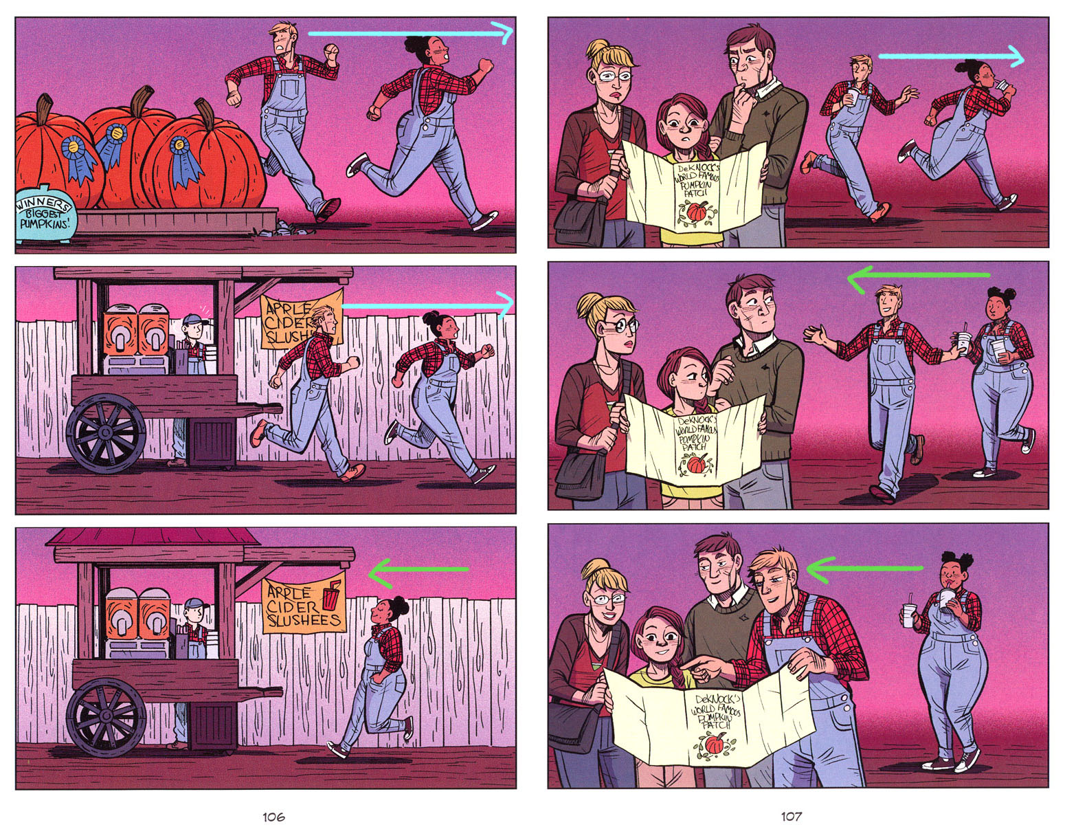
LINE OF ACTION
Line of action is the direction a character moves from panel-to-panel. If a character is running from left to right on a panel, then, unless they change direction, the LINE OF ACTION should continue in the direction of the original panel. Like maintaining an AXIS OF ACTION this helps prevent confusion.

Rainbow Rowell and Faith Erin Hicks’s “Pumpkinheads”
Or even PROMOTES it!

Rainbow Rowell and Faith Erin Hicks’s “Pumpkinheads”
EYELINE MATCH
When characters are positioned at equal heights, usually as the reader moves between panels, you want the eyes to be positioned at roughly the same height every time relative to the other character’s position. A taller person should be placed higher in panels, even when they are portrayed without the other character in that panel. A shorter person should be placed lower in panels. This is not a hard-and-fast rule (and there’s about a million reasons to break it), but it’s generally something to think of when positioning characters within panels, especially if one character is more dominant over another and you want to establish that emotional connection.
You can see this in this same scene we visited earlier from “Laura Dean.” Laura Dean is not only physically higher than Freddie, she’s also in control. Her higher positioning continues through every panel until the last one when the lower character (Freddie) finally makes eye-contact, looking up. She’s suddenly gone up a rung in the girlfriend-ladder, but since this is a downward shot, it still gives her a sense of feeling diminished and uncertain. It’s a lovely juxtaposition of “moving up” but “staying down”!

Mariko Tamaki and Rosemary Valero-O’Connell’s “Laura Dean Keeps Breaking Up With Me”
…
And that’s it for now! Comics are so infinitely varied and there are so many ways, whys, and reasons you’d want to draw scenes from different angles and POV, but hopefully these conventions help to give you a place to start and springboard from as you’re thinking about how to draw (or write!) your comic.
And, as always, if you enjoyed this article, do me a favor and buy at least one of the books that I have used in these examples. The books shown here are by artists and writers who are visionaries and exemplaries in this field. Support their craft so that they can keep telling wonderful stories that people like us can continue to digest, learn from, and inspire!
…
NEXT up on Let’s Make Magic!: TO INK or NOT TO INK? (that is the question)
Want to hear the latest news? Then subscribe! Once a month, you'll get a newsletter with the latest articles, tips, and comics updates as well as launches. And I super pinky promise not to email you more than that! I loathe spam, and I know that you do too! But in case you change your mind, you can unsubscribe anytime later. 🙂